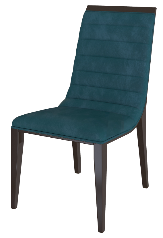
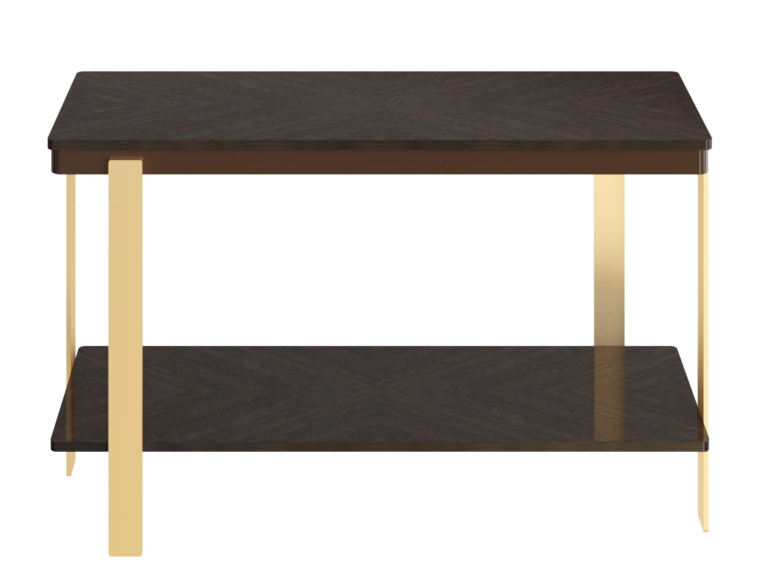
As every year, new and surprising trends make their way into the world of interior design to renew our idea of our home. Trends for spring-summer 2024 arise precisely from unprecedented color and material suggestions, to be matched according to your instincts. Let yourself be captivated by our list of colors, patterns and accessories: you can opt for a total makeover or a little twist that will make every room look like new.
2024 COLOR TRENDS IN INTERIOR DESIGN
Let’s find out the trendy colors in interior design, the ones that will be most used in 2024.
If you are thinking about how to furnish your new home, or if you want to recreate it, these are the colors to focus on.
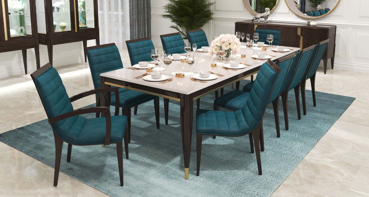
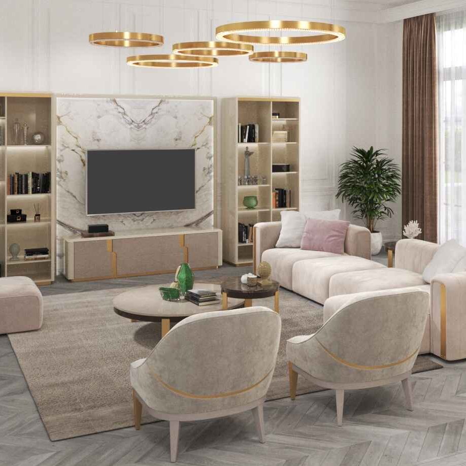
Mark these colors: green-blue, gold, gray. They are the ones you will see most in the furniture proposals and homes of 2024.
Endless dissertations could be made on why these colors are trending, but perhaps there is a simpler explanation: because they are beautiful colors that look great in home decor.
Let’s see them one by one, and how to use them.

Green-blue
Why it appeals
Because it helps slow the heart rate and lower blood pressure. It doesn't do everything by itself, of course, but the presence of this color in the environment would help achieve these results. It doesn't do everything by itself, of course, but the presence of this color in the environment would help achieve these results.
How to use it
In interior design you can use blue to give the overall look a lighter, cleaner impression. A properly chosen blue can create both an atmosphere of study and concentration and one of escape and relaxation.

Gold
Why it appeals This color has always represented light, power and wealth. It is reminiscent of the sun and therefore transmits a sense of warmth and strength. Moreover, it is the color that has been used since ancient times as a symbol of wealth and prosperity and nowadays chosen as a glam proposal for interior design. How to use it The choice of gold in interior design has only one rule to follow: less is more. One must avoid, as mentioned above, a tacky and unglamorous result! The choice of gold color can involve small furnishings such as mirrors, frames, pictures, knick-knacks, coffee tables or dining tables. This choice, if well dosed, will allow you to have a sparkling, bright and delicate home design.

Grey
Why it appeals Gray symbolizes balance and sophistication. It is a neutral shade, not dark, as we are often led to believe! According to color psychology, which analyzes the effects of colors on individual mood and well-being, each shade is associated with sensations, emotions and meanings. How to use it Gray is a versatile color. Adaptability and ease of use in interior design are the distinctive features of this colour. It has many particular shades, from pearl to ash. This allows you to choose the most suitable shade for each environment, to play with tone-on-tone or sharp contrast combinations..


